Friday, 26 February 2016

Final Digipak and Poster

The following images are our final drafts of our poster and digipak:


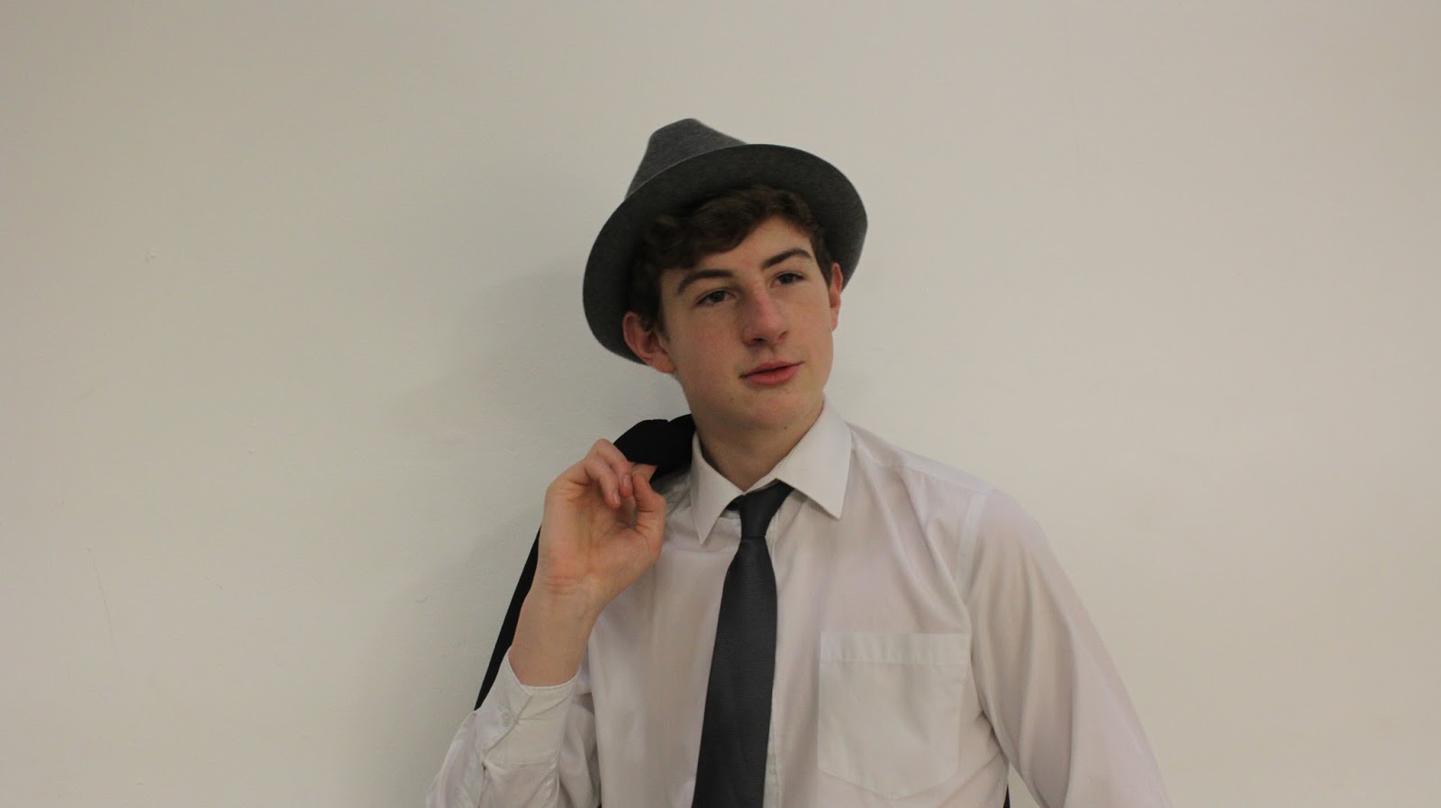
We used an app called colour splash to turn the tie red on our image of our singer. We chose the colour red as it connotes the feeling of love and the album itself is called 'crazy love'. The narrative of our music video is also based around the idea of love and so their is link between the three products. We changed the font colours so they are all matching the same shade of grey, this is because it looks neater this way. The fonts stay the same for the name and title on both the poster and digipak, however it changes for the website and the information about including songs on the poster. This is because it makes it more interesting to look at as well as making the writing stand out more. We changed the photo on the front of the digipak so that it matched the one on our poster, and we also moved the font around so that it matched as well. This is so that the link between the two promotional pieces are clearly shown. We decided to keep the inside of the digipak simple in comparison to our first draft. The reason for this is that it looked as though there was too much going on. Another aspect that we changed on our digipak was the addition of the social media icons. We added these because through our research we notices how many digipaks had these icons on to help promote the artist and their song through intertextaulity as well.


Monday, 22 February 2016

The use of Photoshop

When editing our digipak, we needed to use photoshop to remove the background on one of the images that we wanted to add in.


To do this, we imported the image into photoshop, and used the magic wand background easer tool. This is because we wanted to remove the white background. To ensure that the image of the microphone was saved without the background, we saved the image as a PNG. This then meant we could put the image of the microphone onto our digipak without the white background, ensuring our digipak looked professional and neat.

Friday, 19 February 2016

Poster Feedback

In class today, we showed our poster to one of class mates and asked her for feedback. The flowing image shows the feedback that she gave us:


We found this feedback really useful and as a result are going to make changes to both our poster and our digipak. This is because the feedback has pointed our a few flaws in our poster, such as the lack of colour, and so to make it better and more aesthetic we plan to add colour and also to add more intertexuality, by adding in a website.

Tuesday, 16 February 2016

Digipak Draft

Our digipak draft also matches the typical conventions and aspect of Michael Buble's. This is because we know that it will conform to it's genre's conventions this way. It is also to ensure that the digipak matches our poster. This is important as both as promotional pieces for our song and music video.


Our digipak is also in black and white, matching the theme of our poster. The image on the front of our digipak is different to the one on our poster, but it is off the same actor. We did this to try and make it more interesting. The link is still clear because of the costume and the use of the hat. Something we noticed in our research was that Michael Buble often had his name in a strip going across the front of the digipak, we liked this idea and so thought we would incorporate it into ours. The font on our digipak is the same as on our poster and so highlights the link between the two clearly again.

Poster Draft

The following image is our first draft for our poster. The purpose of this poster is to promote the song 'Haven't Met You Yet', which is what our music video is based on. To help us make this successful and more realistic we used some typical aspects and conventions that Michael Buble uses within his posters and digipaks. An example of this is the use of black and white, we have used this and it is also common amongst Michael Buble's promotional pieces. The titles are also fairly subtle, which is similar to Michael Buble's use of titles. This has helped us to ensure that our poster fits into the conventions of it's genre.


Friday, 12 February 2016

Poster Research

Before starting to create our poster, we did some research. The purpose of the poster, alongside the digipak, is to promote the song. With this in mind, we understood that the poster had to have strong links similarities with the digipak, otherwise the promotion would be confusing for the target audience. I looked at Olly Murs poster and his digipak for his album Right Place Right Time.


 The images on the left show his digipak and poster. The similarities are abundantly clear. The image of him on the poster is the same as the one on the digipak. The fonts are the same, as well as the colour and layout. His poster mentions that there is a number one song on the album, which is something we may do on our poster, to ensure there is advertising for our song. The colour of Olly Murs name matches the braces that he is wearing. This is an idea that  I like and would like to incorporate into our poster and digipak.
Another aspect of his digipak and poster that I like is that the font matches the style of the genre. His music is within the pop genre, and the style of font has a fun feel to it, much like pop music.


Olly Murs digipak has influenced my ideas for our digipak and poster, in terms of the style and the way they match things up within the individual products as well as the two together.

Wednesday, 10 February 2016

Feedback

Today in class we all went around and viewed each other rough cut and gave feedback. The feedback that we received on our video was very useful. We need to improve on the lip syncing in a couple of areas of the video as it is slightly out of sync. As well as this, there are a couple of shots that are shaky or out of focus which we will need to either film again or remove. However, a couple of shots can be fixed by using the warp stabilizer. We found this feedback very useful in helping to improve our video. There was also positive feedback, in which people said that they enjoyed our use of close-ups. They also said that they thought our narrative was good, and that our actors and shots helped to make it all believable. An example they gave of this was a shot of our actor running. One other positive that we were given was the link between the narrative and the song lyrics. The feedback they gave said that they enjoyed the link, and that it made me the video more interesting. Below is an image showing some if the feedback that we were given:


Monday, 8 February 2016

Rough Cut

The following video is our rough cut :


We are planning on filming some of the shots again as we aren't completely happy with all of them. This is because some of them are unfocused or have objects in the background which hinders the mise-en-scene. The costume of our singer is also something we would like to change. This is because we believe trousers will look better than jeans.

Friday, 5 February 2016

Photo's


Today we decided to use the cameras to take some photos for our digipak and magazine advert. We thought that a white background would look good and help to allow our actor to stand out more. There is a variety of different poses and angles within the photos we took, and below there are a few examples of the photos.


Wednesday, 3 February 2016

Editing

Today, we decided to do some editing for our music video. We have worked on matching up the lip syncing and ensuring that the video flows between shots of the narrative and the performer. Below our a couple of images of our editing process:


Location

We decided to film our actor for the singing part of the music video in our school theatre. This is because it is easily accessible and has a plain white wall. My research into jazz music video's taught us that they typically have quite bright lighting. We thought that the plain white wall, along with ensuring all the lights in the theatre are on, would create a light setting for us to film his singing. A photo of the stage we filmed on is below, along with a photo of our actor during the filming.

These photos both show how there is a light setting for us to film in and how it is bright, helping us to conform to the conventions.

Tuesday, 2 February 2016

Presentation Feedback

After presenting our idea to our class (a prezi can be seen in a previous post relating to the presentation) we had a range of feedback which can be seen in the images. Most of the feedback was positive in terms of the song and how it matched our narrative that we have created. Another positive piece of feedback was that they thought that our choice of actions within the video linked in well with the lyrics, something which our questionnaire showed most of our target audience liked. 

They did also say that we needed to think about our location and variation of shots. A big piece of feedback that we found exceptionally useful was the idea of adding in shots of another character unrelated to the narrative to be singing. This is to make our video more interesting and also to ensure it looks like a music video and not a short film. 

Monday, 1 February 2016

Haven't Met You Yet Plan

The following is a prezi which is all about where we are at in progress with our video and idea's for 'haven't met you yet'. We will be presenting this to our class and getting feedback to help us improve further upon our ideas.

Digipak


Before starting our digipak we decided to look at some others. Firstly, we looked at the typical layout of a digipak which can be seen below:


We then went on to look at the different digipak styles for the different genres of music. Pop genres tend to have very colourful and busy digipak's. An example of this is Katy Perry's Teenage Dream album's digipak. It is very bright and girly, the colour scheme is pinks and blues. The images are all linked and flow nicely. The target audience is clearly teenage girls.


The next digipak I looked at was The Paper Kites album Woodland. The genre of this band is folk/indie. There digipak is not as bright as Katy Perry's, it does however have a constant theme throughout. Unlike the pop genre, the artists are not seen on the digipak. The main theme of the digipak is in correlation with the name of the album as it is focuses on trees and flowers and the woodland setting.


To help ensure that our digipak fitted in the our genre I looked into Michael Buble's digipak's. I noticed how a continued theme throughout his album's digipak's is that there is an image of him on the front and the writing is inside a strip going across the image. I thought this was something we should also do as it was clearly a theme linked to Michael Buble and his albums, and so by doing it with our one it will help us with the advertising part of our coursework task. I also noticed how he is usually well dressed in his digipak's and so thought that our actor should be well dressed as well. A typical convention of jazz is that the artists are well dressed and so this will help us to conform to the conventions, as well as make our digipak more aesthetically pleasing.